
After researching into artist's from the 'indie pop' genre's websites, I created a sketched draft of what the homepage could look like:

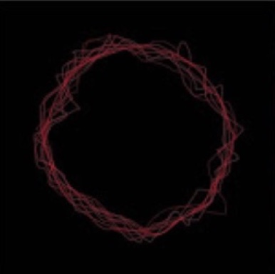
The ring around the album name and video as well as the font is taken from the lines used in our album on the artist and around the CD. The background would be black with the writing being in red to comply with the colour palette of our album and video. The layout is fairly minimalistic making it accessible yet also visually intriguing. The thumbnail of the video would incorporate the artist's face so that she too appears on the homepage as it's not simply the music we're promoting but also the star image.
0 comments:
Post a Comment