Focus Group: Presentation and Feedback
Here is the video of the focus group that Eddie filmed as Eden asked the questions and I presented the website:
Here is a write up of our feedback that we compiled as a group:
Website Response:
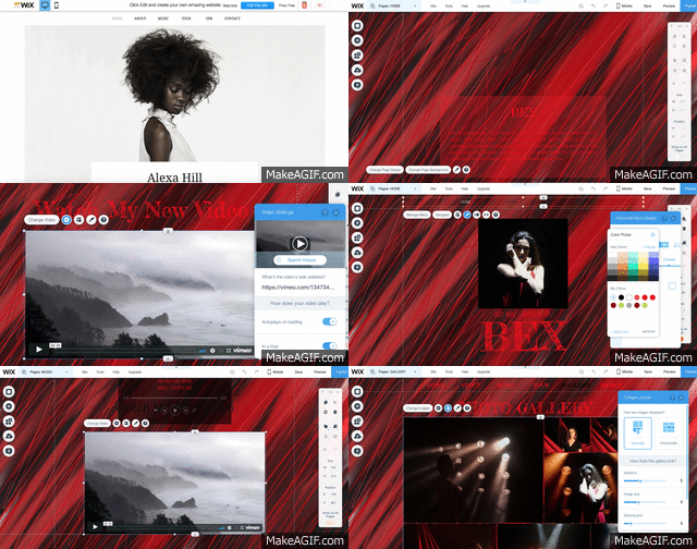
When asking our focus group about whether they though the website was accessible and easy to navigate, they all said yes and showed an general liking towards the overall look.
We asked about whether or not the genre was clear and they said no however when following this up, asking what genre they thought it could be the majority said pop whilst others swayed more to an 'independant' artist like Adele.
As a group, we anticipated that largely due to the colour scheme, the audience may not be able to clearly identify what genre we're complying to. So, we asked them what they thought we could alter to clarify it. One person said that we could consider changing her costume making it slightly more welcoming and potentially use lighter colours to add some variation as well as making it more appealing to a commercial audience.
We then asked them if the product seemed authentic at this stage, if it looked like a genuine site or a site made by students. The respones were all positive stating that it looked like a site they would pull up themselves. One thing that we thought made it seem slightly unauthentic was the tabs and whether we had enough and if the ones we did have were relevant. When asking the group, they said that the tabs worked but if we wanted another, we could concider designing and including merchandise.
We wanted to find out more about what engages our audience so we asked if there were any specific things that they liked and disliked about the site. These included things such as the way I presented the tour dates with the alternate colours, that the background stays static as you scroll down each page and also how accessible her social media is, making her seem very personable. When it came to their dislikes, the main issue was the colouring of the text. Although they found the colour scheme appealing, having her name and the tabs red made it seem a little bit washed out which I agree with. As a new artist, her name really needs to be a focal point so when developing the site, I'll experiment various other colours.
Digipak (the content below was curated by Eden from my production group):
From the initial look at the digipak design, the focus group had mixed opinions on what they believed the genre of the artist is. Firstly, one person in the group said rock, however through some discussion, other people suggested indie rock and alternative rock, which other students then agreed with. As for the people who did not agree with these suggestions, we assumed that they believed the genre to be pop, as when we showed them the website, they all agreed it was pop, so we can make an academic assumption that they think the genre is pop. This overall opinion is shown in the graph below.
• When we asked the group if they believed that the design was realistic and looked like it belonged to a real music artist, there was a total agreement within the group.
• As for what they liked particularly about the digipak design, one member of the group said that they liked the use of the artist’s signature on the front of the design, and a few other people agreed.
• In terms of what they didn’t think worked in the design, the same person in the group said that they thought the font needed to be more continuous through the panels e..g the front and back fonts needed to be the same.
• When we asked if they thought the four panels complemented well, one person said yes because of the use of colour scheme that allowed the panels to look related etc. However, we also had another member of the group saying that they didn’t think they complemented well, because they thought the two inner panels did not work in conjunction with each other, although they looked good individually.
• When gaining the groups opinion on the use of colour scheme in the design, they all collectively agreed that even though it majority just black and red, that it still worked well.
• When asking them if they thought the design looked like it was for an album or a single, they all agreed yes it was obvious, however when asked specifically why, no one said because of the fact that there were multiple on names on the back page of the design (which seems like the most obvious reason) but one person said it was because of the album title on the front page of the design.
Music Video (the content below was curated by Eden from my production group):
We started off with the music video questions. These were stared off with asking if anyone lost interest at any point, the focus group all said the video kept their focus throughout the whole three minute runtime. The next question that we moved onto was to see if anyone had a favourite part of the video. We received a few responses, these included, the group of dancers with the red cloth background, when the blinders turn on behind Yasmin, the close up shots on Yasmin’s face when she is filmed in front of the blinders, the active and wandering camera during Daisy’s and Chrissy’s dance section.
We then moved onto asking the focus group if they had a least favourite section of the video. We also received a few responses for this, they included, the third element where Yasmin is sat down on the floor and some people thought that the fade out was a weak ending, but this was contested in the focus group as some people like the fade out at the end.
We then moved onto questions regarding the overall campaign, these were started off by asking the focus group if they believed that the who campaign had a consistent aesthetic. Of the 11 people in the room 9 people thought that the campaign had a consistent aesthetic. The focus group thought this because the red and black colour scheme is extremely consistent, and the artist is very clear on all three of the products, she is also wearing similar clothes in all three of the products.
Finally we asked if it was clear that it was the same artist for the music video and the Digipak, the focus group aid that it was very clear. This was due to the fact that we see the artist face very clearly on the front cover and the colour palette between the two products is very similar.


