Monday, 11 December 2017

Focus Group: Presentation and Feedback

Focus Group: Presentation and Feedback


Here is the video of the focus group that Eddie filmed as Eden asked the questions and I presented the website:


Here is a write up of our feedback that we compiled as a group:


Website Response:

When asking our focus group about whether they though the website was accessible and easy to navigate, they all said yes and showed an general liking towards the overall look.


We asked about whether or not the genre was clear and they said no however when following this up, asking what genre they thought it could be the majority said pop whilst others swayed more to an 'independant' artist like Adele.


As a group, we anticipated that largely due to the colour scheme, the audience may not be able to clearly identify what genre we're complying to. So, we asked them what they thought we could alter to clarify it. One person said that we could consider changing her costume making it slightly more welcoming and potentially use lighter colours to add some variation as well as making it more appealing to a commercial audience. 


We then asked them if the product seemed authentic at this stage, if it looked like a genuine site or a site made by students. The respones were all positive stating that it looked like a site they would pull up themselves. One thing that we thought made it seem slightly unauthentic was the tabs and whether we had enough and if the ones we did have were relevant. When asking the group, they said that the tabs worked but if we wanted another, we could concider designing and including merchandise.

We wanted to find out more about what engages our audience so we asked if there were any specific things that they liked and disliked about the site. These included things such as the way I presented the tour dates with the alternate colours, that the background stays static as you scroll down each page and also how accessible her social media is, making her seem very personable. When it came to their dislikes, the main issue was the colouring of the text. Although they found the colour scheme appealing, having her name and the tabs red made it seem a little bit washed out which I agree with. As a new artist, her name really needs to be a focal point so when developing the site, I'll experiment various other colours.


Digipak (the content below was curated by Eden from my production group):


From the initial look at the digipak design, the focus group had mixed opinions on what they believed the genre of the artist is. Firstly, one person in the group said rock, however through some discussion, other people suggested indie rock and alternative rock, which other students then agreed with. As for the people who did not agree with these suggestions, we assumed that they believed the genre to be pop, as when we showed them the website, they all agreed it was pop, so we can make an academic assumption that they think the genre is pop. This overall opinion is shown in the graph below.


When we asked the group if they believed that the design was realistic and looked like it belonged to a real music artist, there was a total agreement within the group.

  As for what they liked particularly about the digipak design, one member of the group said that they liked the use of the artist’s signature on the front of the design, and a few other people agreed.

In terms of what they didn’t think worked in the design, the same person in the group said that they thought the font needed to be more continuous through the panels e..g the front and back fonts needed to be the same.

When we asked if they thought the four panels complemented well, one person said yes because of the use of colour scheme that allowed the panels to look related etc. However, we also had another member of the group saying that they didn’t think they complemented well, because they thought the two inner panels did not work in conjunction with each other, although they looked good individually.

When gaining the groups opinion on the use of colour scheme in the design, they all collectively agreed that even though it majority just black and red, that it still worked well.


When asking them if they thought the design looked like it was for an album or a single, they all agreed yes it was obvious, however when asked specifically why, no one said because of the fact that there were multiple on names on the back page of the design (which seems like the most obvious reason) but one person said it was because of the album title on the front page of the design. 

Music Video (the content below was curated by Eden from my production group):

We started off with the music video questions. These were stared off with asking if anyone lost interest at any point, the focus group all said the video kept their focus throughout the whole three minute runtime. The next question that we moved onto was to see if anyone had a favourite part of the video. We received a few responses, these included, the group of dancers with the red cloth background, when the blinders turn on behind Yasmin, the close up shots on Yasmin’s face when she is filmed in front of the blinders, the active and wandering camera during Daisy’s and Chrissy’s dance section.

We then moved onto asking the focus group if they had a least favourite section of the video. We also received a few responses for this, they included, the third element where Yasmin is sat down on the floor and some people thought that the fade out was a weak ending, but this was contested in the focus group as some people like the fade out at the end.

We then moved onto questions regarding the overall campaign, these were started off by asking the focus group if they believed that the who campaign had a consistent aesthetic. Of the 11 people in the room 9 people thought that the campaign had a consistent aesthetic. The focus group thought this because the red and black colour scheme is extremely consistent, and the artist is very clear on all three of the products, she is also wearing similar clothes in all three of the products. 


Finally we asked if it was clear that it was the same artist for the music video and the Digipak, the focus group aid that it was very clear. This was due to the fact that we see the artist face very clearly on the front cover and the colour palette between the two products is very similar.

Saturday, 9 December 2017

Focus Group: Preparation

Focus Group: Preparation


When it came to preparation for our focus group, each member of the group prepared what was needed based on what element of the campaign they were looking into. I made some final alterations to my first draft of the website and ensured that it was live and published, sending the link to my teacher ready to be accessed easily, Eden printed 5 copies of our digipak design and folded it in the configuration of an actual album and Eddie exported our initial edit of the music video onto a harddrive formated soecificallyto be compatable with our teachers computer. 

As well as conducting these small tasks, we all wrote questions about our products. Some of the questions were repeated for multiple products because they were relevant to them all. As well as writing questions for the individual products, we wrote questions that compared the digipak and website as well as the campaign overall. You will find the questions below:


FOCUS GROUP QUESTIONS


Website Questions:

  • Does the website seem accessible and easy to navigate?
  • What genre do you think we’re conforming to?
  • Why is it this genre? (refer to pictures, layout, font and use of colours)
    • If they think we aren’t conforming to our genre, what could we alter to clarify it?
  • Does this look like a real website? If so why? If not why? 
  • Is there anything in particular that you like? Why?
  • Is there anything in particular that you don’t like? Why?
  • Is there anything you’d like to see more on the website?
  • Is there anything you on the homepage you think is missing?
  • Are there any tabs missing that you’d expect to see?
  • Do you think you should be able to purchase the album on the homepage or have to search for it in other tabs?

Although these are meant to be open questions, there were specific things that we wanted to target such as the tabs in the website and the genre projected from the design.  Other than that, the reason why these are our final questions is so that we can understand how the audience view our products. Our opinions are bias as it's our work so getting outside opinions is necessary to know whether what we thing is effective really is.


Digipak Questions:

  • What genre do you think we’re conforming to?
  • Why is it this genre? (refer to pictures, layout, font and use of colours)
    • If they think we aren’t conforming to our genre, what could we alter to clarify it?
  • Does this look like a real album? If so why? If not why? 
  • Is there anything in particular that you like? Why?
  • Is there anything in particular that you don’t like? Why?
  • Do the panels compliment one another? Do they belong to the same album, is there an obvious link? 
  • What’s your opinion of the colour scheme? 
    • If the response is negative, ask how we can alter it to make it more visually intriguing 
  • Is it obvious that the digipak is for an album not a single?

Many of the questions for this section are the same as those from the website as there are certain things such as the genre and level of engagement with the audience that is equally important for both. There were aspects of the digipak that we weren't sure helped us connote the 'pop' genre such as the font and colour scheme, hence why there are some questions aimed specifically towards them.


Website and Digipak Questions:

  • Do these two elements of the campaign link together? If so, how? If not, why?
  • Are the backgrounds in these two elements too similar?
  • Is it obvious these are for the same artist?

Before even attempting to present the music video, we needed to compare these two products to ensure they look like they belong to the same artist as well as tackling the range of how similar and different they can be


Music Video Questions:

  • Did you lose interest at any point?
  • Which element did you enjoy the most?  (We might need to specify what ‘element’ refers to)
  • What was your favourite part of the video? -- Did you have a favourite part?
  • What was your least favourite part of the video?

The video is essentially a marketing technique to promote the album so if the don't find it interesting, would they be likey to follow up on the album? We wanted to identify what caught their attention and what let it go.


Overall Campaign Questions:

  • Do you think our aesthetic is consistent throughout the campaign?
  • If there was something you would change about the overall campaign what would it be? 
  • Does the music video and album clearly belong to the same artist?

Our campaign has to be consistant in order to show clearly that it belongs to one artist as well as seeing if there were any details that they would ideally change overall.


Friday, 8 December 2017

Focus Group: What it's purpose?

Focus Group: What it's purpose?


A focus group is a step taken within the music industry to gain accurate and honest feedback from the artist's target audience on a campaign. It involves presenting the campaign beginning with the website, followed by the digipak, and ending with the music video. The reason as to why you present the products in this order rather than showing the video or playing a song first, is so that you can gain a candid opinion as to what genre the audience think we're appealing to. It would be more valuable to find out how you could alter our campaign to impliment the genre conventions rather than have the audience view our products with a pre-conscieved idea as to what it is. In order to gain specific feedback, you prepare a variety of open, unbiased questions on each product individually as well as questions comparing the website and digipak and finally the campaign on the whole. The reason why we conduct 'focus groups' rather than surveys is so that we can get more accurate opinions fresh from their first viewing of the product without any outside influence.

Although our products at this stage aren't complete, it is good to test them on our target audience at this point as there is still time to develop them. There is still the advantage that we're not likely to be too attached to the work we've already done therefore making alterations shouldn't be hard.

We want to find out how to engage the audience, whether the genre is clear and if not, how we can make it clearer and whether our products link together clear to make one overall campaign. We need to avoid closed or biased questions as we won't get a precise response.

Monday, 4 December 2017

Constructing the Website

Constructing the Website


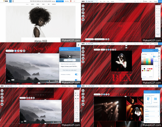
Below are some screenshots of my process creating the first draft of our website ready for our focus group.


Here are some screenshots of each page in the first draft:

Friday, 1 December 2017

Constructing the Digipak

Constructing the Digipak


Eden's main focus was on the digipak, making it look as though it belongs to the same campaign and artist. Below is a video of her process as well as screenshots of the development:


Change in front and back covers:

Screenshot from Eden's blog
Altered album font:


Screenshots taken from my blog

Thursday, 30 November 2017

Editing the Music Video

Editing the Music Video


When constructing our three products, we split the work between us all focusing on one product each. Eddie Beck focused on editing the music video, creating a performance cut and then a rough cut before going ahead and finalising the product. 

Rough cut:


Performance cut:


Wednesday, 29 November 2017

Behind Scenes Photos

Behind Scenes Photos


In order to organise the photos I took on the shoot day, I created a gallery on 'flickr.com':


https://www.flickr.com/gp/137301191@N03/m59A79


Tuesday, 28 November 2017

Shoot Day Evaluation

Shoot Day Evaluation


On the morning of the shoot, I woke up excited about the day ahead and eager to get started. It wasn't until I had all my bags packed that the nerves set it. I suddenly started worrying asking myself questions like 'what if the dancers don't know what their doing?', What if the costumes don't work with our set the way we wanted?' However, we as a group were organised in terms of rehearsing before the day and sending the dancers videos so that they could practise as well as making sure we saw them all in costume beforehand, so really there was nothing to worry about.

When we arrived on the shoot day making sure all our performers knew when and where to meet us. I went to the editing suite where we were all meeting at 8:30 and laid out all the costumes in piles for each performer that they had given me prior to the shoot day throughout the week.


When the performers arrived, Eden and I began to do their hair and makeup starting with Yasmin as our artist and then Daisy and Chrissy, the two dancers in the first element. Whilst we weren't doing makeup, they all got into their starting costumes. The aim was to start filming at 9am. Unfortunately, we were about ten minutes late as the hair and makeup took longer than anticipated but we hurried down to the studio as soon as possible and started filming at 9:10.

The studio didn't look particularly different to how we'd left it the day before, however, by the time Eden and I made it down to the studio, after finishing the hair and makeup for Yasmin, Daisy and Chrissy, Eddie had set up the camera and our lighting designer was programming the lighting desk. The overall look was exactly what we envisioned. The silhouettes looked very effective and it worked very well with just two dancers. 

In terms of our jobs roles, we decided before the shoot that we would alternate the roles throughout the elements, allowing us to all have some variation. However, as we were behind schedule, we didn't really get the opportunity to change so Eddie manned the camera for most of the day, with me doing some shots throughout the day, I directed the performers and Eden did the playback and floor manager work.

In terms of managing the performers on set I think I kept the actors on track and ensured they knew what they were doing as well as feeling comfortable with it. Throughout takes, I stood behind the camera and called out certain directions like arm work or particular facial expressions I wanted Yasmin to make. It was interesting to see how as we went through each different lens on the camera, Yasmin also became more and more confident with taking and enacting the directions I gave her. 
Our biggest problem was that we ran out of time. We were too indulgent with the shots we took in the first two elements, granted that we did almost create another one element within the first set up where we filmed Yasmin from behind. By the time we had lunch, we had finished our first element and completed half the shots for the second element with one of the dance sequences. However, we still had one dance sequence to go in the second element that was vital so we couldn't just move onto the third.

Also, after seeing the first two elements, we alongside our teachers weren't sure that our third element would cut well. We'd anticipated that it wouldn't quite work but we wanted something different to cut to, something that would help build the video. However, we began to think of alternates to solve the problem and eventually agreed that we would change our third element.

As we were setting this new idea up, I let the dancers go, knowing that we wouldn't get round to filming anything more with them.
Our interaction between the group was consistently really good as we discussed what vital shots we needed and how we might alter the composition of certain shots. We were all on the same page throughout the day making sure that we all pulled our weight. I think what was most successful was how we approached the set. Although we didn't have a slight battle for time, we were all very set on what we wanted and determined to get everything we wanted before the day was done.
The only part that I felt could have gone better would be our use of time. Although we managed to come up with an alternate, it would have still been beneficial to have the extra time.
Prior to the shoot day, I messaged the performers as well as telling them in person when trying on costumes and rehearsing, what time they had to meet us and where. After doing their hair and makeup I ensured that the three other dancers not being used in the first element were happy to wait, knew what they needed to do and how the day would work. When getting into the studio, we started by filming the dancers first, largely to allow Yasmin, our artist to get used to how the shoot would work in terms of how many shots we needed to get and also so that once we had finished with the first two dancers, they had time to relax before getting ready for the second element. Daisy, one of our dancers, had been in other music videos previously and helped other girls get the hand of the day in general. 

With the lighting we had in the first two elements, I made sure to be aware of how hot the dancers would get so I had water on side ready for them as well as ensuring they took a little break if they needed as we changed the set up of the camera.
I think the part of the shoot that I enjoyed the most was the second element. We didn't have the studio set up exactly how we'd planned with a red infinity screen because it wasn't long enough to fit all the dancers without seeing the screen leave frame. However, we alongside our set designers created a more intriguing textured set. When we got the dancers in and saw the lighting with the shadows and silhouettes, it made me feel a lot more confident about the shoot and the choreography I'd made.

There are certain shots from the first element where Eddie moved the camera sporadically to follow the dancers as they caught different light that I'm looking forward to the most. Within this element we created a second set up where we filmed Yasmin from behind her right shoulder with the lights shining from behind her.


I think as a group, we worked really well. We all worked really hard on the day to make sure we completed our job roles as well as staying on the same page as to what shots we needed to get. When changing the set ups, we all got involved trying to get everything done as quickly as possible to begin filming again.
If we were to do our shoot again, I think we would have to keep a better eye on the time rather than be too indulgent with the dancer's shots. Despite the fact we did manage to manipulate two different set ups within the elements, it would have been nice to have been able to complete our final planned third element as it would have created a variation rather than all read and black.
However, overall I don't think that anything that happened on our shoot day would cause for us to have to alter our website or album artwork as the colour scheme stayed the same and the artist had the look we had originally planned for.