
After a long development process, we have finalised our campaign. Below are our final products:
MUSIC VIDEO
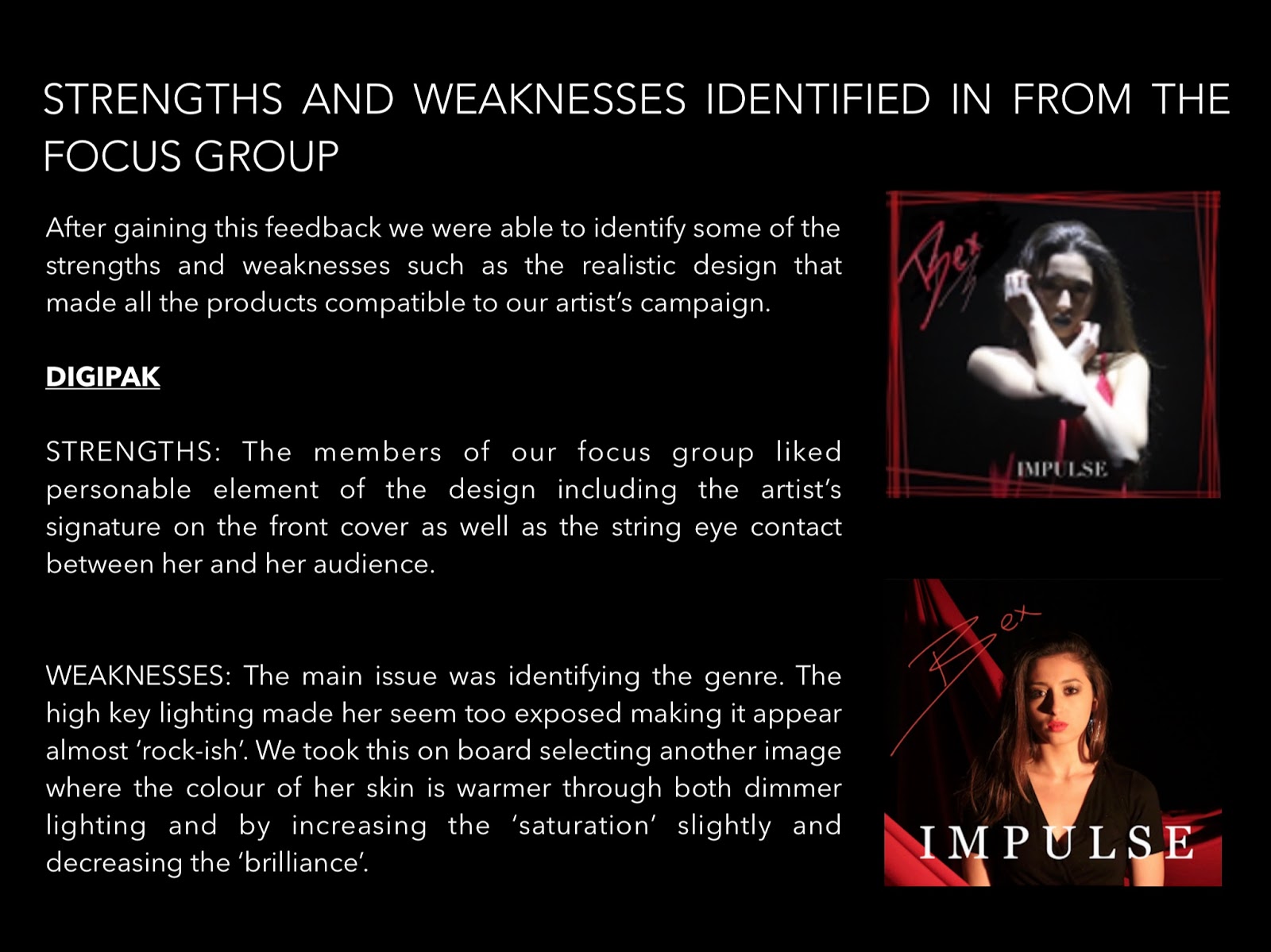
DIGIPAK

https://oripooles.wixsite.com/bex-music


 |
A screenshot from my blog
|


 |
A screenshot from my blog
|
 |
A screenshot from my blog
|
 |
A screenshot from my blog
|
 |
A screenshot from my blog
|
 | |
|
 |
| A screenshot from my blog |
 |
| A screenshot from my blog |
 |
| A screenshot from my blog |
 | |
|
 | |
|
 | |
|
 | |
|
 | |
|
 | |
|


