Monday, 20 November 2017

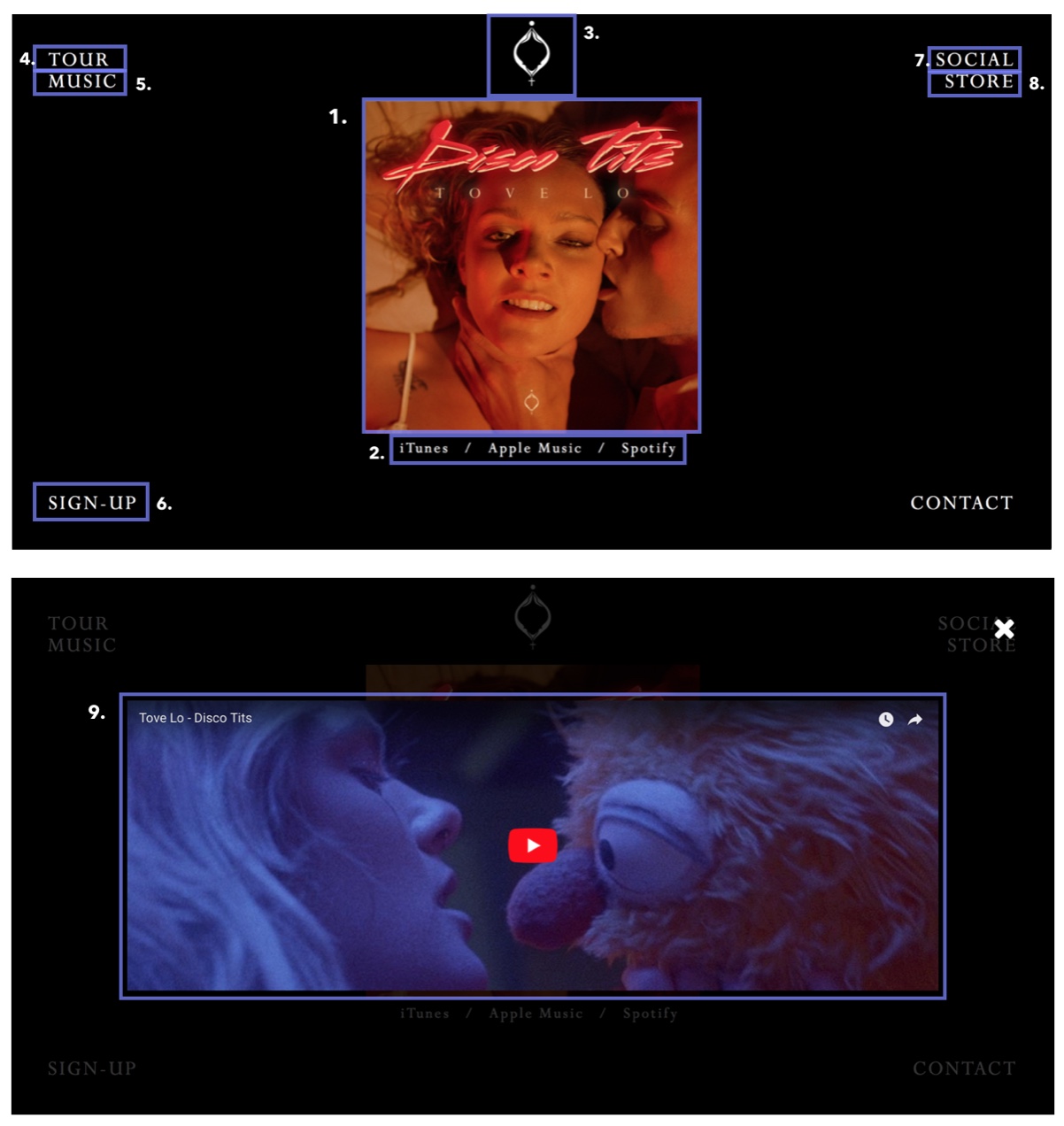
Website: What Should Be Included?


1.   Album Artwork
2.   Links to purchase artist's music
3.   Artist's logo
4.   Links to tour tickets
5.   Link to listen to music
6.   Link to subscribe 
7.   Links to social media
8.   Link to merchandise 
9.   Music video


Homepage's also often contain tabs to a:

- Photo gallery 
- Video gallery
               (Both of which show the behind the scenes process of the creation of the video)

There will also be a tag with legal information from the record label and/or management

for the artist.The combination of all these details creates the star image as well as establishing the target audience. When the audience click on the website, it needs to be easy to navigate seeing their new music and where and how to purchase the artist's products. It is also important to see a link between the website and the other elements of a music campaign.

Saturday, 18 November 2017

Album Artwork: Our Chosen Design


After looking and comparing all our drafts we complied the panels from each individual draft and created a rough draft of our chosen idea:

We all really liked the unique quality that Eddie added to the CD panel and front cover as it is rather minimalistic yet it uses the colour scheme them runs through our campaign and also applies to the genre conventions making the artist the main focus. 

Eden and I had similar ideas as to having the artist on the back however Eden used a photo of her from a side on perspective whereas as I think to contrast more the the front cover, she should be facing away from  the audience with her body but angle herself so that her face is towards the viewer.

For the inner left panel, we're going to base it off of Eden's design as it links back to our music video and other images that we'll use for the website.

The font that we would use would have a closer link to the lines used on the front cover with the artist as well as the CD panel to link each image together as well as linking it to the campaign.

Friday, 17 November 2017

Album Artwork: Comparing Our First Drafts and Making Decisions To Plan Our Final Design


After giving each other feedback on our first drafts, we looked more into comparing them, seeing what was similar what was different and what we wanted to transfer to our final design.

My design:


Eden's design:


Eddie's design:

Eden and I shared a lot of similarities, both using a close up of the artist on the cover and then having her also appear on the back. Although Eddie chose to have her on the front, he didn't include her on the back, instead, he simply included the track list with a background of neon red lights. Eden and I were both intrigued with how well his linked to the music video, however, as we're promoting a new artist, we have to create an accurate star image that would be carried through not only the rest of the campaign but for future products. For our final design, we will include Yasmin, our artist, on both front and back of the album. 

Eden and I also both incorporated the hands, an ongoing motive that will be exploited in the artist's and dancer's movement; Eden used the hands on the inner left panel whereas I used them on the CD panel. We liked that in my design there were so many hands filling the entire panel with limited negative space. However, we weren't sure on whether we to incorporate them into the inner left or CD panel. 
When looking at Eden and Eddie's design for the CD panel, I came to the conclusion that the hands would be best placed on the inner left because I really liked the minimalism of their designs. I think that after having the artist on the front and back cover, it would be nice to have one more simple panel to contrast the business of the others. 

Eddie's design for the CD panel was particularly interesting as it linked to his design for the front cover. Before developing our designs, I showed Eddie and Eden an Instagram profile of a fashion designer named Katrina Knizikevičiūtė Bajoras who has a unique style which I thought about incorporating. The lines on the artist's face would add a quirkiness and something stylistically different from every other 'indie pop' artist whilst still appealing to the genre conventions. 

The one decision that still needs to be made is what font to use. We all agreed that we want it to seem like handwriting creating a more personal feeling between the artist and her music as well as the artist and her audience.

Thursday, 16 November 2017

Album Artwork: First Draft Feedback


In our lesson today, Eddie, Eden and I all presented our first drafts of our Digipak designs to one another getting feedback on what has worked well, what could be improved and what we think we can develop into our final design.


The response to my draft was positive. Eddie and Eden said that putting the artist on the front and back was good not only because we're introducing a 'new artist' but because it applies to the genre conventions of 'indie pop' as well as Dyer's star theory. 

They talked about how the use of the hands placed on the CD panel creates a strong link to our music video as it's a motive carried through by the artist's movement as well as the dancers. However, the colour link here could be stronger; the red and black colour scheme runs through the whole digipak but this panel seemed a little bit bland. 

The reasoning behind the use of the lips on the inner left panel was supported by the rest of my group but it seemed too bold a choice for the inside of the album. Eden also used the hands in her draft however she placed them on the inner left and had a more plain CD panel. I feel like this is a stronger decision as the hands could potentially get lost when the CD is added and as it's a link to our video, we need to accentuate it.

The concluding feedback that I got was about the font and about the absence of the artist's name on the front cover. I wanted to give the feel of the artist's handwriting on the album so when we come around to develop our final album artwork, we'll likely transfer genuine handwriting rather than a font.

Overall, Eddie and Eden felt that I applied the genre conventions well by having the artist present on three of the panels in a variety of shots; a close up of her face and hair, a mid shot of her torso and an extreme close up of her lips also bringing out more of the  amorous side of 'indie pop' artists. The link between my design and our overall campaign was strong with the same colour scheme as well as the addition of the hands.

Wednesday, 15 November 2017

Album Artwork: Choices and Decisions Behind My Design


I began by editing the photos, adding a red tint to them whilst also increasing the 'black point' level to heighten the red and black colours which will be consistent throughout the campaign within the website and our music video. 


In the panel with the CD, I developed my idea from the sketch so that the hands weren't just surrounding the CD but were all around the panel. The hands are significant as it's an element that we're going to highlight with our artist in the video with her draping her hands around her face as well as the dancers. 

For the front and back of the album, it's important to have the artist present as it not only fits the genre conventions of 'indie pop' but it also allows us to manipulate the star image which is important as we are aiming to create a 'new' artist. 


The final image would be on the inside left of the album. I wanted it to be something eye catching that involved the audience but was different to the front and back. The slight sexual appeal of the image plays to the genre conventions and the demands of the target audience. 

Tuesday, 14 November 2017

Album Artwork: My First Draft


After sketching out my idea, I created a rough draft of what our digipack could look like using screenshot from our test shoot, our casting photo of our artist, and other developed photos and drawings.

Album Artwork: Sketching My Draft


In our lesson today, my group and I started to draft our album artwork. We began by brainstorming some of our initial ideas of what we all wanted to achieve from our design. After brainstorming, we each individually compiled a draft of what we envisioned for the artwork. By doing this individually, we were able to come up with three different designs. 

Before compiling my first draft, I sketched my design out into a grid of four boxes with the spine in the middle, the same as how we will lay out our final design. This was my sketch:


This was Eddie's:


This was Eden's:


From looking at the sketches, there are a lot of similarities such as having the artist on the front and back which conform to the genre conventions of 'indie pop'. It will be interesting to see how we all transfer our sketched into first drafts.

Monday, 13 November 2017

Album Artwork: Similar Products


As we're beginning to think about our album artwork, we have to take into consideration the genre that we're trying to comply with. Therefore, I conducted some more research into synonymous artist's albums. I'm going to look into the album artwork of artists such Lykke Li and Lana Del Rey as these are all artists from the 'indie pop' genre.

The Lykke Li album artwork that I am looking at is from her album named 'I Never Learn'.
By starring on the front cover of the album, Lykke Li is conforming to the conventions of 'pop' as a genre, however, her costume, facial expression and positioning are what alters the look to suit 'indie pop' conventions specifically. The cover is black and white without any glimpse of colour, highlighting her face and hands against her black costume. The connotations of the colour black connotes a sense of elegance and formality, supporting the unconventional 'pop' but unique 'indie pop' genre. 


The back contains the tracklist in a small white, 'handwriting-like' font against a grey background that includes the same mesh material that she wears draped over her head on the cover. The inside of the album has an off-white background that contrasts with the plain black CD. The inner left echos the back of the album, listing the songs in the same font but in black.  

Her positioning, as well as the makeup she wears on the album, is unique because it doesn't instantly project an air of beauty but would attract an audience's eye as it's not entirely mainstream. As she has been placed on the front cover, according to Dyer's star theory, she is conforming to the ideology that an artist in a commodity and is built/moulded to be sold. If she wasn't present on the cover, it would convey that the label was trying to sell the music itself rather than an image of a star.


The Lana Del Rey album that I looked into was her most recent release, 'Lust For Life'.

The album cover contains three of the most typical components, the artist's name, the album name and the artist themselves. Lana Del Rey is the key focus of the album, being placed in the centre of the frame and looking directly forwards at the audience.The font, as well as the colour scheme, is consistent throughout the front, back and inside of the album. This moulds the genre of the music as well as almost becoming a trademark for the specific album and would likely be used throughout the website and any advertisement for future tours.


When creating the album artwork for our own artist, there are specific elements from the two above that I will take influence from. For example, I think that for our genre, the artist has to be placed on the front cover, looking at the audience with a recognisable potentially handwritten font as I feel it adds a more personable feel. We have a colour scheme of red and black that is weaved throughout the music video idea that will be transferred to the album too.

Friday, 10 November 2017

Album Artwork: What Should Be Included?


As we're beginning to consider our design for our album artwork, we briefly discussed elements of an album that you'll find on nearly every album. We made two lists stating what we need to include and what we should consider in our design.

Album artwork must include:

- The artist's name
- The album name
- A colour scheme that is reflected in the 
  rest of the campaign i.e. music videos and 
  website
- Song/track list
- Barcode
- Studio/leal information
- Warning if there is explicit content

Things to consider:

- What star image you are creating
- Do the artist appear on the cover? -- genre convention
- The layout of each panel i.e the rule of 
  thirds
- Composition of the frame -- 
  foreground/background
- Font
- The link between the four panels and 
  spine
- The link to the other elements of the
  campaign

In order to gain a better understanding of what we should be producing, we looked at some examples from previous years: